CreateAthon

17 04 2011

I was able to be a part of CreateAthon on Campus at UTC last weekend. The juniors and seniors plus some local designers got together for over twenty four hours to improve Dalewood Middle School. Some of the design work included a redesign of the school art room and lobby, student reading level charts, web presence, and branding.

I was lucky enough to end up on the branding team, where I helped to design a useable logo for the school. Dalewood already had a mark, a knight riding a horse, and we wanted to keep the look and feel of that, but make it more versatile. We ended up with two marks, a shield for the main mark and a knight’s helmet to be used mostly for sports.

Going into the CreateAthon, I had expected it to be challenging to stay focused (and stay awake) for an entire twenty four hours, but with all of the people around that shared our passion for design, it was easy to keep our energy level up. We got a lot more done than was even planned beforehand, and I think Dalewood will benefit greatly from the work we’ve done.


Senior Exhibition

5 04 2011

I’ll be in show 1 of the Senior Exhibition in Cress Gallery at the University of Tennessee at Chattanooga. It’s been a very long road preparing for it, but finally, the opening’s tonight.

I’ve posted before about my piece, and it’s been a learning experience creating it. Video isn’t necessarily a medium I pictured myself working with, but it’s been a learning experience.

Here’s my artist’s statement:

“The mind can imagine scenarios so vivid it distorts perceptions of reality. There are, somehow, certain ideas and images that are universally seen as disturbing, even without insinuating any immediate danger or bodily harm.

A dark hole, a camera angle, an eerie sound, or an overly lifelike mannequin, human beings have seemingly instinctual, visceral reactions to many of these ideas and imagery. But why? What is the mechanism in the back of my mind that tells me to avoid, at all costs, the ceramic doll at grandma’s house – the one on the closet shelf in the spare bedroom? Is the media to blame, or is it something more primal at the center of our shared consciousness that shapes our instinctual, irrational, imperceptible fears?”

All of the artists will be speaking at 4:30 today, and the show officially opens at 5:30. There are going to be a lot of great artists and designers there and a lot of fantastic pieces, so it’s definitely worth a look.


Type Drawings

12 03 2011

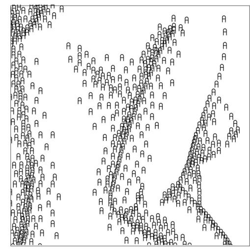
Despite being a graphic designer, I’ve never been a very big typography person. Sure, I have my typeface preferences, but I’ve noticed I’m not nearly as passionate about it as some of my peers. I wanted to repurpose type to be used for something I’m more interested in, so I’m working on a series of typography drawings adapted from some figure studies I still have. They’re in very raw stages so far, but I plan on experimenting more with text orientation, size, font, and color.

I’m paying a lot of attention to how the fonts and font sizes affect the overall aesthetic of the image over all. Going into this project, I sort of had the assumption that the personality of the image would end up being the same or similar to the character of the typeface, but I’m quickly finding that the personality of the overall image can be quite different than the personality of the typeface. For example, I did one using the X from a typeface called Invalid. The font has a futuristic, technical quality, but the image looks cross stitched.

I’ve got a ways to go with this project, but I think it’s coming along well.


Foundations Candidates

6 03 2011

I was able to attend the presentations given by Robert Cox and Jessica Wohl at the UTC art building. I’ve had Robert as a professor twice; once a couple of years ago for color theory, and just last semester for drawing 5. I already had an idea of some of his principles and his teaching style. He encourages his students to make work they feel strongly about, no matter what it might be.

And it’s apparent that he is very passionate about his own work as well. Most of his work is inspired by local nature and call attention to preservation issues. He has been active in helping preserve local wildlife and his concerns show through in his artwork.

I was very interested in both the subject matter and the style of Jessica’s work. Many of her pieces had a very illustrative quality to them that reinforced the narratives depicted. The idea of inside vs. outside was present throughout all of her work, which brought a nice consistency to it.

I was also very interested in the student work that she presented. After having been in the art department for almost four years, I have a very good idea what kinds of assignments are given, and I think she could have some unique and different ideas that could hone some skills in students that may not be touched on with other professors.

I feel that both of these candidates would be a good choice for the position in their own ways. They both seem to have very effective ways of teaching and very developed skills that are unique to them.


CritterToons

14 02 2011

This is a logo I did for a children’s TV station called CritterToons. I wanted the logo to convey the whimsical nature of 80s and 90s cartoons. I chose the name CritterToons because I wanted it to recall memories of the fun of Saturday morning cartoons, the excitement and spontaneity that these older shows had that tend to be toned down in a lot of shows today. I see the word “critter” as describing a child. It has an animalistic, yet playful connotation that describes that nature of the cartoons the station airs well.

I wanted to make the logo seem like a living entity, to seem like a “critter” in and of itself. It had to be something that had potential to be animated; it only makes sense that a logo for a company that produces animation would be animated. The hand drawn quality is relatable to children, and the C with its teeth and the E with its eye become characters of their own. I also chose a bright, interchangeable color pallet that would provide a variety of possible choices.


Senior Exhibition Progress

3 02 2011

This piece is an exploration of paranoia, particularly everyday images that take on disturbing or nightmarish qualities. The video installation will be scenes taken from real life that have subtly disturbing qualities to them. I want to question, first of all, why these images disturb us. There is nothing logically there to be afraid of; there’s really no danger present but the imagery remains unsettling.

I’m taking a lot of inspiration from phobias, nightmares, and horror movies. The project started out as simply a recreation of nightmares, and I wanted to use not the straightforward ones where you’re some kind of danger, but those that are disturbing in a less obvious way. I have expanded the project to be an exploration of real life objects, places, and situations from a disturbing, surreal perspective. I want to experiment with creating unsettling or frightening images without resorting to putting the viewer in danger. Why do we find these images disturbing when there’s really no danger present?

I also want to look at the possible sources of these irrational fears we have. Are these reactions simply defense mechanisms engrained into us since birth? Or are they learned over time through society or the media? For example, are so many people afraid of clowns because of killer clown movies, or were clowns frightening to begin with? Horror movies especially tend to reuse scenarios and styles of camera work that become cliché, and we begin to recognize them immediately. If I were to use some of these horror movie tropes out of context, would I be able to get the same reaction out of viewers as the originals do?

The footage used in this video will be mostly unedited, aside from cutting down and putting together scenes and minor adjustments. No special effects will be used, however. The point of the video is for the footage to be as realistic as possible. It should cause discomfort on its own without the need for extra enhancements.

Here are a few screenshots from the footage taken so far.


Logo/banners/name badges

22 02 2010

For the “Engage” logo, we needed something that would express the idea of the retreat. We needed something that would be fun but classy, something that designers would be “engaged” with. I wanted to do something somewhat literal because the overall idea of the logo needed to be seen at a glance. My first idea was to create a logo with the concept of the game Connect 4. It seemed distant abstract enough that it wouldn’t be expected, but at the same time, easy to get. However, the image was a bit bulky and the letters looked a bit awkward inside the circles. I tried a few different things connecting letterforms also. I also eventually experimented with hand done type instead of computer-generated typefaces to get a more tactile, personal feel.

When we finally decided to work with Lillie’s “dot’s” logo, I was assigned to do web banners. I wanted to keep the look of the name badges that Jared had made with the dots falling away. The two colors on white work well because it is easy to read and feels cohesive with the badges and the rest of the brand established in the brief and with the logo.


Simple Pleasures

20 01 2010

Drawing has always been a simple pleasure of mine. I think the reason I never gave it up as a kid was because it gave me a way to express myself or visualize ideas much more completely than most people are able to. I never really thought of myself as an “artist” when I was younger, though my mom often called me one. I wasn’t necessarily interested in art (at least not the type you would find in art museums); I just felt like a person who likes to draw. I was probably in high school before I started to consider myself to really be an artist (and still, I don’t think I was completely there yet).

Though I definitely enjoy drawing as art now and using it in my graphic design work, I still love drawing just to imagine. I don’t know if I would consider any of my drawings that I do for fun “art” at all, especially since mythical creatures, often the subject of my drawings, are looked upon as being camp, but the title of “art” doesn’t really matter to me in this sense. I also don’t really like to call it a talent, either; I believe that anyone who can observe things around them and learn from them can acquire the ability to draw. (Although, I won’t lie, I occasionally find happiness in showing off now and then.) But the real joy in having the ability to draw is that I can see things in my head more clearly when I illustrate them, and I really can’t imagine myself not having that ability. It’s so much a part of me; I’m sure that if I wasn’t fascinated with drawing, I would be a very different person today.


Banner Research

12 01 2010

In my discussion with Drew and Austin, we found that great web banners, or even decent ones, are few and far between. A lot of web banners that I came across were very bland with nothing more than some words tacked on to a horizontal or vertical box and maybe a logo (if you’re lucky). Either that, or it went too far in the other direction and became overdone usually with cheesy type and glaring bright colors.

But we were able to find a few that worked nicely and were designed well. I think by the end of the discussion, we all agreed that the simpler designs seemed to do their job better than the complicated ones. While we did find some more elaborately designed banners that worked, the type often got lost in the clutter.

I actually managed to find three web banners that had some nice design elements, two of which were animated, but I wasn’t able to save them as gifs.

The first banner I found was for Blackberry. Since I couldn’t capture the actual animation, you can’t really see the full effect, but I took screenshots of two different frames so you can have some idea of where it started and where it ended. It was fairly straight forward, as you’ll find all of my examples to be, and while we agreed that the logo wasn’t our favorite, it’s a relatively well designed banner, and the tagline “a private film fest at your fingertips” tells you what their product does in a simple but exciting way.

This H&R Block banner was also animated, but I could only get the one screenshot since the animation didn’t loop. The green background that takes up the left side was actually an animated cube that turned to a different face each time some new text came up. It was a nice way to take advantage of their name and logo, and like was discussed in our reading for Professional Practices, makes the logo a living entity like an avatar.

I chose this banner mostly because it was one of the only ones with any real texture that didn’t seem cluttered. The color orange catches your attention and while the slogan “get moving” leaves the banner’s real purpose a bit vague, it’s still an interesting enough banner to make you want to click. The subtle arrow works with the slogan, and the brand name and logo works very well because with only the letters “MVMT” it still makes me want to read it as “movement”.



Bleeds

7 12 2009

Handout

Poster

Shirt

My word for this project was bleeds. I decided to go with a humorous approach on my poster, handout, t-shirt, and presentation, and use the image of a person literally bleeding off of the page. I liked the idea of using the margins, page edges, and bleeds as they are represented in InDesign, but I wanted to give them a little more character, so I drew them with a brush in Illustrator. I also wanted to use many of them in my poster to create an interesting pattern.